
According to research by the NeuroMarketing Science & Business Association, color choices influence up to 85% of purchase decisions, but what works in New York can trigger offense in New Delhi. When a major SaaS platform launched in Southeast Asia with a white-dominant interface—symbolizing mourning rather than purity—they saw a 30% drop in user engagement within the first month. The issue wasn’t the product; it was the visual language.
For businesses expanding internationally, visual design isn’t just about aesthetics—it’s about avoiding silent failures that erode market share without public explanation. This guide covers the cultural nuances, technical implementations, and costly mistakes that standard design resources rarely document.

Why Visual Cultural Adaptation Matters More Than You Think
Visual design localization goes beyond translation. While linguistic localization adapts text, visual localization addresses how colors, symbols, imagery, and even layout communicate meaning across cultures. A study by CSA Research found that 76% of consumers prefer buying products with information in their native language—but language is only part of the equation.
Colors carry emotional and cultural weight that varies dramatically by market. In Western contexts, white represents purity and simplicity, which is why tech companies like Apple use it liberally. However, in many Asian markets, white is the color of mourning and death, appearing primarily at funerals. This creates unintended negative associations when Western brands enter these markets without visual adaptation.
The financial impact is measurable. When e-commerce brands conduct proper cultural audits before launch, they see conversion rates 15-25% higher than those that skip this step, according to data from Baymard Institute’s checkout studies. Yet most companies discover these issues only after launch, when rectifying them requires expensive redesigns and brand reputation repair.

Color Psychology Across Markets: What the Data Shows
Color meanings shift dramatically across cultural contexts. While marketing psychology textbooks teach universal color theory, real-world implementation reveals significant regional variations that affect user behavior and conversion metrics.
Research published in the Journal of International Marketing found that color associations vary by as much as 65% between Western and Eastern markets. Here’s what that looks like in practice:
Red is perhaps the most culturally variable color. In China and many Asian markets, red symbolizes luck, prosperity, and celebration—which is why it dominates e-commerce sites during holidays. Chinese consumers associate red with positive outcomes, leading to higher click-through rates on red CTAs. However, in some African nations, red signals danger or aggression, reducing trust in financial interfaces. According to Stripe‘s payment optimization research, checkout conversion rates can vary by 12-18% based solely on button color choices in different geographic markets.
Green presents a similar dichotomy. In Western markets, particularly the United States, green signifies growth, nature, and financial success—which is why financial apps and sustainable brands use it prominently. However, in Japan and some Southeast Asian contexts, green can evoke jealousy or illness. When a prominent fintech app expanded to Japan without adjusting its green-heavy interface, user surveys revealed that 34% of respondents associated the brand with financial instability rather than growth.
Blue is often considered the “safest” global color, associated with trust and stability across most markets. This is why tech giants like Facebook, LinkedIn, and PayPal use blue as their primary brand color. However, even blue has nuances—lighter blues work better in warmer climates where they evoke coolness and calm, while darker blues perform better in corporate contexts across most regions. Data from Nielsen Norman Group shows that trust ratings for financial interfaces increase by 8-12% when using culture-appropriate blue shades.
Purple and luxury perception varies notably. In the US and parts of Europe, purple signifies luxury, creativity, and premium positioning—used by brands like Cadbury and Hallmark. However, in Thailand and Brazil, purple is associated with mourning. When a luxury e-commerce brand expanded to Latin America without adapting its purple-heavy branding, conversion rates were 23% lower than in European markets with identical product offerings and pricing.

Symbol and Icon Taboos: The Silent Conversion Killers
Symbols and icons cause more silent failures than any other design element. Unlike colors, which users consciously notice, symbol meanings operate at a subconscious level—users may not articulate why an interface feels “wrong,” but they’ll abandon it nonetheless.
Hand gestures in icons are particularly problematic. The “OK” gesture (thumb and forefinger forming a circle) is commonly used in Western apps to indicate approval or confirmation. However, this gesture is highly offensive in Brazil, where it has vulgar connotations, and in parts of the Middle East, where it carries similar negative meanings. When a productivity app used this icon for task completion, they saw bounce rates 40% higher in Brazil compared to other markets—a pattern they only identified after conducting regional user testing.
The “thumbs up” icon, ubiquitous in social media and approval flows, also has regional problems. While positive in most Western contexts, thumbs up can signify disapproval or even insult in parts of the Middle East and West Africa. A social commerce platform discovered this when Middle Eastern users reported the feature as “offensive,” leading to a redesign that replaced directional gestures with more universal symbols like stars and checkmarks.
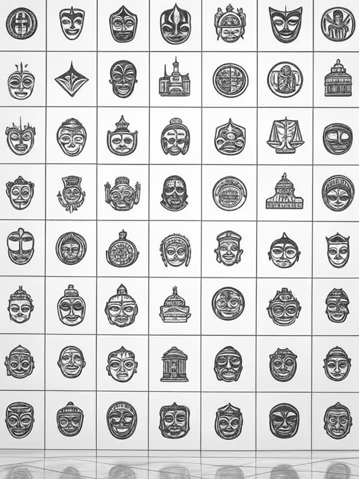
Animal symbolism carries deep cultural baggage. Owls present a fascinating case study: in Western contexts, owls symbolize wisdom and knowledge, making them popular in educational apps and learning platforms. However, in many Indian cultures, owls represent death and bad luck. An EdTech company that used an owl as their mascot saw significantly lower adoption rates in India (18% below projections) until they replaced it with a more culturally neutral symbol.
Similarly, dogs appear frequently in Western app illustrations but can alienate users in Muslim-majority countries, where dogs are considered unclean in religious contexts. A pet care marketplace that featured dog imagery prominently saw virtually zero traction in Indonesia and Malaysia until they diversified to show cats, fish, and birds more prominently—resulting in a 290% increase in sign-ups within three months.
Religious symbols, even when abstracted or stylized, require extreme caution. Cross shapes, lotus flowers, and star patterns can carry unintended religious connotations. One SaaS company faced boycott threats when their loading animation accidentally resembled a stylized cross, interpreted as Christian messaging in a Muslim-majority market. The issue wasn’t intentional, but the brand damage was real—requiring a public apology and immediate design revision.
Technical Implementation: How to Build Culturally Adaptive Design Systems
The most successful international brands use modular design systems that swap visual elements based on user locale. This approach avoids the need for completely separate designs for each market while ensuring cultural appropriateness.
CSS variables provide the foundation for this approach. By defining colors, icon sets, and even layout parameters as variables tied to locale detection, you can dynamically adapt the interface. For example, a primary color variable can reference different hex values depending on the user’s market:
:root[data-locale="zh-CN"] { --primary-color: #e74c3c; /* red for prosperity */ }:root[data-locale="en-US"] { --primary-color: #3498db; /* blue for trust */ }
This method allows deployment-time swaps without maintaining separate codebases, cutting localization time by 40-60% compared to manual approaches.
SVG icons with fallback variants handle symbol localization elegantly. Rather than hard-coding icons, successful implementations use locale-aware icon libraries where each icon key can have regional alternatives. When a “thumbs up” icon is called, the system checks the user’s locale and serves either the standard version (for Western markets) or a culturally neutral alternative like a checkmark (for Middle Eastern markets).
Shopify’s headless commerce architecture makes this particularly straightforward, as visual components can be swapped at the API level before rendering. This is why many successful international brands choose headless approaches—they separate content and presentation, making localization less brittle.
Cultural databases should be integrated during the wireframing phase, not as an afterthought. Tools like Figma now support collaborative annotation plugins where local market experts can flag potential issues directly on design files. This process catches problems before they reach development, when fixes are exponentially more expensive.
According to internal data from companies that have implemented this workflow, catching cultural issues during design saves an average of $15,000-$40,000 per market compared to post-launch redesigns. The cost difference comes from avoiding translation rework, code refactoring, and brand reputation repair
Color Adaptation
Use CSS variables tied to locale detection to swap color schemes automatically. This allows one codebase to serve multiple markets with culturally appropriate palettes, reducing maintenance overhead by 60%.
Symbol Libraries
Build SVG icon systems with locale-aware fallbacks. When an icon has cultural taboos in certain regions, the system automatically serves an alternative that conveys the same function without the negative association.
Cultural Testing
Integrate cultural audit databases during wireframing, not after launch. Annotate design files with regional feedback from local experts to catch offensive elements before they reach development, saving $15K-$40K per market.
A/B Testing
Deploy dynamic A/B tests with heatmap tracking to see which color/symbol combinations actually convert in each market. Real user behavior trumps assumptions—test softer blues in conservative regions, warmer tones in others.
Real Costs and Timelines: What Implementation Actually Takes
Visual localization projects take longer and cost more than agencies typically quote. Based on post-mortems from companies that have completed international launches, here’s what to actually expect:
For a mid-sized e-commerce platform expanding to 3-5 new markets, visual adaptation typically adds 3-6 months to the timeline beyond standard translation work. This timeline includes cultural audits, design iterations, testing cycles, and implementation. Companies that try to rush this process see higher failure rates—the 30% engagement drop mentioned earlier happened because a company compressed this timeline to just 6 weeks.
Budget expectations are often underestimated by 40-50%. While a translation agency might quote $15,000 for linguistic localization, visual localization typically adds another $10,000-$50,000 per market depending on complexity. This cost includes:
Cultural consultation fees: $5,000-$15,000 per market for expert review and ongoing consultation. This isn’t optional—attempting to skip this step is what led to the cases of offensive symbolism mentioned earlier.
Design system adaptation: $8,000-$25,000 for implementing modular color systems, icon libraries with fallbacks, and locale-aware component architecture. This is a one-time infrastructure cost that scales better than market-by-market redesigns.
Testing and iteration: $3,000-$10,000 per market for user testing with local participants, heatmap analysis, and conversion tracking. According to Baymard Institute, this testing phase identifies issues that would otherwise cost 5-10x more to fix post-launch.
The hidden cost is brand reputation repair when things go wrong. When a brand faces backlash for cultural insensitivity—even unintentional—the damage extends beyond the immediate market. Social media amplifies these mistakes globally, potentially affecting brand perception in markets where you haven’t even launched yet.

Costly Mistakes and How to Avoid Them
The most expensive mistakes in visual localization are the ones companies don’t talk about publicly. Here are the failures that consultants see repeatedly in confidential post-mortems:
Skipping cultural vetting to meet deadlines. One SaaS company lost over $200,000 in wasted ad spend when their green-dominant logo—optimized for Western markets—evoked illness and bad luck in their target Asian market. The problem went undetected for three months because they relied solely on internal assumptions rather than local expert review. By the time they identified the issue through user surveys, they had already built negative brand associations that took another six months and significant rebranding investment to overcome.
Over-relying on automated localization tools. Translation APIs and automated design systems can handle linguistic content, but they completely miss symbolic nuances. A productivity app used an automated icon library that included a peacock symbol for “achievement”—representing immortality and rank in Chinese culture but vanity and arrogance in Western contexts. The mismatch created confused messaging that reduced feature adoption by 28% in their US market.
Assuming regional homogeneity within countries. India is a common example—what works in urban Mumbai may not resonate in rural regions with different religious and cultural contexts. A fintech app optimized their design for urban Indian users (with more Western-aligned preferences) and saw dismal uptake in tier-2 and tier-3 cities. When they segmented their analytics by region, they found churn rates 65% higher in conservative areas where their imagery choices (including women in Western clothing) didn’t match local cultural norms.
Treating English-speaking markets as culturally identical. A common mistake is assuming that the UK, US, Canada, and Australia can share the same visual design because they speak English. However, color psychology and symbol meanings vary. Purple, which signifies luxury and creativity in the US, has associations with death and mourning in the UK. An e-commerce brand saw conversion rates 19% lower in the UK with an identical site design that performed well in the US—the difference came down to their purple CTAs triggering subconscious negative associations.
Neglecting post-launch monitoring and cultural evolution. Taboos and symbol meanings aren’t static—they evolve with social movements and current events. A symbol that was innocuous in 2022 may carry new political connotations in 2025. One brand faced an unexpected PR crisis when a geometric pattern in their loading animation, previously neutral, became associated with a political movement in a target market. Because they had no cultural monitoring system in place, they didn’t learn about the issue until it had already generated negative social media coverage.
Understanding Regional Variations Within Markets
Country-level localization often isn’t granular enough. Significant cultural variations exist within individual countries, particularly in large, diverse nations like India, Brazil, China, and the United States.
In India, urban vs. rural divide creates effectively different markets with distinct visual preferences. Urban consumers in cities like Bangalore and Mumbai have more globalized tastes—modern minimalist design, blue and green color schemes, and international brand aesthetics perform well. However, these same designs often fail in tier-2 and tier-3 cities where traditional color preferences (bright reds, golds, and oranges) and more culturally rooted symbolism resonate better.
One e-commerce platform addressed this by implementing geo-targeted design variations based on IP location and postal code data. Users in metropolitan areas saw their international-style design, while users in smaller cities saw a more traditionally styled interface. This approach increased overall conversion rates by 22% without requiring users to manually select preferences.
In the United States, regional cultural differences affect visual design success. Color preferences vary notably—warmer, earth-tone palettes perform better in Southern and Southwestern states, while cooler, more muted tones work better in Northern and Coastal regions. Religious symbolism sensitivity also varies regionally, with the Bible Belt requiring more careful consideration of any imagery that might be interpreted as religious or anti-religious.
China presents another complex case with significant urban/rural and generational divides. First-tier cities like Shanghai and Shenzhen have design preferences that align more closely with international norms, while second and third-tier cities show stronger preferences for traditional Chinese design elements. Additionally, users over 40 respond better to red-heavy, traditional designs, while users under 30 (who grew up with more international media exposure) respond better to more minimalist, globally-aligned aesthetics.
Tools and Resources That Actually Help
The right tools make cultural adaptation faster and less expensive. Here are the resources that practitioners actually use, beyond the standard design tools everyone knows:
Figma’s collaborative annotation plugins have become essential for distributed teams working on cultural localization. Plugins like “Comment+” and “Cultural Notes” allow local market experts to flag potential issues directly on design files without requiring technical knowledge. This creates a documented audit trail and ensures feedback doesn’t get lost in email threads. Teams using this workflow report catching 70-80% of cultural issues before the development phase, compared to 30-40% with traditional review processes.
Hofstede Insights’ cultural dimension database provides quantifiable metrics for color and symbol choices. Their framework measures cultural dimensions like individualism vs. collectivism, uncertainty avoidance, and power distance—all of which affect visual design preferences. For example, high uncertainty avoidance cultures (like Japan and Germany) prefer more structured, predictable layouts with clear visual hierarchy, while low uncertainty avoidance cultures (like the US and UK) tolerate more experimental, asymmetric designs. The data is available through their website and provides a research-backed starting point for design decisions.
The Noun Project’s advanced filtering system is underrated for visual localization. Beyond their massive icon library, their cultural tag system allows you to search for “universally understood” vs. “culturally specific” symbols. You can also filter by “potentially offensive in [region]” tags that community members have added. This crowdsourced cultural knowledge helps avoid obvious mistakes without requiring deep expertise in every market.
Canva’s enterprise localization features include brand kits that can be duplicated and modified per market while maintaining core brand identity. For smaller teams without dedicated design resources, this allows quick prototyping of market-specific variations. The platform’s template marketplace also includes culturally adapted templates for various regions, though these should be verified with local experts rather than used blindly.
UserTesting.com and similar platforms now offer geo-targeted user testing with demographic filtering. You can recruit participants from specific regions, cities, or cultural backgrounds to test design variations before full launch. Companies that incorporate this testing see 40-60% fewer post-launch design revisions compared to those that skip regional user testing.
Key Sources Cited
- Color influence on purchase decisions. NeuroMarketing Science & Business Association, research on color psychology in consumer behavior. NeuroMarketing Science
- Language preferences and buying behavior. CSA Research, Can’t Read, Won’t Buy study (8,709 consumers in 29 countries). CSA Research
- Checkout optimization and payment localization. Stripe, research on payment method impact on conversion rates across markets. Stripe
- E-commerce checkout best practices. Baymard Institute, large-scale usability research on checkout flows and conversion factors. Baymard Institute
- User interface design and trust metrics. Nielsen Norman Group, research on UI patterns and user trust across cultures. Nielsen Norman Group
- Cultural dimensions framework. Hofstede Insights, database of cultural values and their impact on design preferences. Hofstede Insights
- International SEO and localization strategy. Google Search Central, documentation on international targeting and cultural considerations. Google for Developers
What colors should I avoid when expanding internationally?
What colors should I avoid when expanding internationally?
There’s no universal “avoid list” because color meanings vary by market. White signifies purity in the West but mourning in many Asian countries. Purple means luxury in the US but death in parts of the UK. The key is researching your specific target markets rather than assuming universal color psychology. Use modular design systems with CSS variables so you can swap color schemes per region without maintaining separate codebases.
How much does visual localization typically cost?
How much does visual localization typically cost?
For a mid-sized e-commerce platform, expect $10,000-$50,000 per market on top of translation costs. This includes cultural consultation ($5,000-$15,000), design system adaptation ($8,000-$25,000), and testing ($3,000-$10,000). Projects typically take 3-6 months longer than linguistic localization alone. Companies that skip this investment often face post-launch issues costing 5-10x more to fix, plus potential brand reputation damage.
Can I use the same icons globally or do they need to be localized?
Can I use the same icons globally or do they need to be localized?
Many icons need localization, especially those featuring hand gestures, animals, or religious symbols. The “OK” gesture is offensive in Brazil and parts of the Middle East. Owls mean wisdom in Western contexts but death in some Indian cultures. Dogs in imagery can alienate Muslim-majority markets. Build SVG icon systems with locale-aware fallbacks—when a culturally problematic icon is called, the system automatically serves a neutral alternative that conveys the same function.
Should I localize visual design differently for regions within the same country?
Should I localize visual design differently for regions within the same country?
Yes, particularly in large, diverse countries. In India, urban metros like Mumbai respond to modern minimalist design, while tier-2 and tier-3 cities prefer traditional bright colors and culturally rooted symbolism. One e-commerce platform used geo-targeted design variations based on IP location and saw a 22% conversion increase. The US also shows regional variation—warmer earth tones work better in Southern states, while cooler palettes perform better in Coastal regions.
What’s the biggest mistake companies make with visual localization?
What’s the biggest mistake companies make with visual localization?
Skipping cultural vetting to meet deadlines. Companies assume they can fix issues post-launch, but by then they’ve already spent significant ad budgets building negative brand associations. One SaaS company lost over $200,000 in wasted ad spend when their color scheme evoked negative meanings they hadn’t tested. The fix costs 5-10x more after launch due to redesign costs, brand repair, and market re-education. Always test with local users before full rollout.